What this tool does
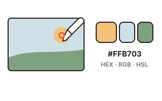
Sometimes a color in a photo is exactly the one you want for a design, a blog theme or matching paint and clothes. This tool tells you the color of the spot you click in three notations — HEX (a code like #8ECAE6), RGB and HSL — and gives it a plain name such as 'light blue'.
It also picks out the colors used most in the whole photo and shows them as a palette, each with the share of the picture it covers. The palette copies in one go as a HEX list or as CSS variables.
How to use it
- Press 'Choose a photo' or drag one onto the box. A screenshot can be pasted with Ctrl+V.
- Move the mouse over the photo: the magnifier shows the pixels around the pointer. Click to pick the color.
- Press 'Copy' next to HEX, RGB or HSL and paste it where you need it.
- Under 'Main colors', see the photo's palette and choose 5, 8 or 12 colors.
HEX, RGB and HSL
HEX writes the strength of red, green and blue as two hexadecimal digits each; it is what websites and design programs use most. RGB writes the same three values as numbers from 0 to 255, and HSL splits a color into hue (0–360 degrees), saturation and lightness, which makes changes like 'a bit lighter' easy. All three describe the same color.
Neighboring pixels in a photo rarely match exactly, so one click can land on a speck or a shadow. Watch the center square of the magnifier, or move one pixel at a time with the arrow keys and press Enter to pick.
How the main colors are found
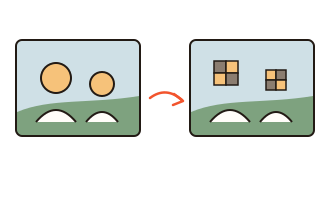
The photo's pixels are placed in CIELAB, a color space shaped like the differences people actually see, and close colors are grouped; each group's average becomes a swatch. The same photo always gives the same palette, and two nearly identical swatches are merged. The percentage is the area of the photo that group covers.
Names come from a rule set based on hue, lightness and vividness — 'pale blue', 'deep green'. Different colors can share a name, so use the HEX code when the exact color matters.
Will text be readable on it?
For the picked color, the contrast of white and of black text on top is calculated by the web accessibility standard (WCAG). 4.5:1 or more reads well as body text; 3:1 or more suits large text (about 24 px, or 19 px bold). At 7:1 or more it says 'very readable'. Pick two colors one after the other to see the contrast between them as well.
Your data
Photos are opened and read inside this browser only and never sent to a server. Only your recent color codes and the palette size are remembered in this browser.
Questions and answers
Screens show colors differently. Is the code right?
The code is read from the file, not from your screen settings, so it is the same on every device. Screens differ in brightness and color settings, so only how it looks changes.
Can I pick a color from elsewhere on my screen?
On a computer, Chrome and Edge show a 'Pick from screen' button: it picks from anywhere, even other windows. Phones and other browsers do not support it, so the button is hidden there.
A palette color looks slightly off.
A swatch is the average of a group of similar colors, so it can differ a little from the most common color in that group. Click the photo to get the exact color of a spot.
What about transparent parts of a PNG?
Pixels more than half transparent are left out of the palette. Clicking a fully transparent spot gives black (#000000).
Where are my picked colors kept?
The last 12 stay under 'Picked colors', in this browser only. 'Clear the list' removes them.